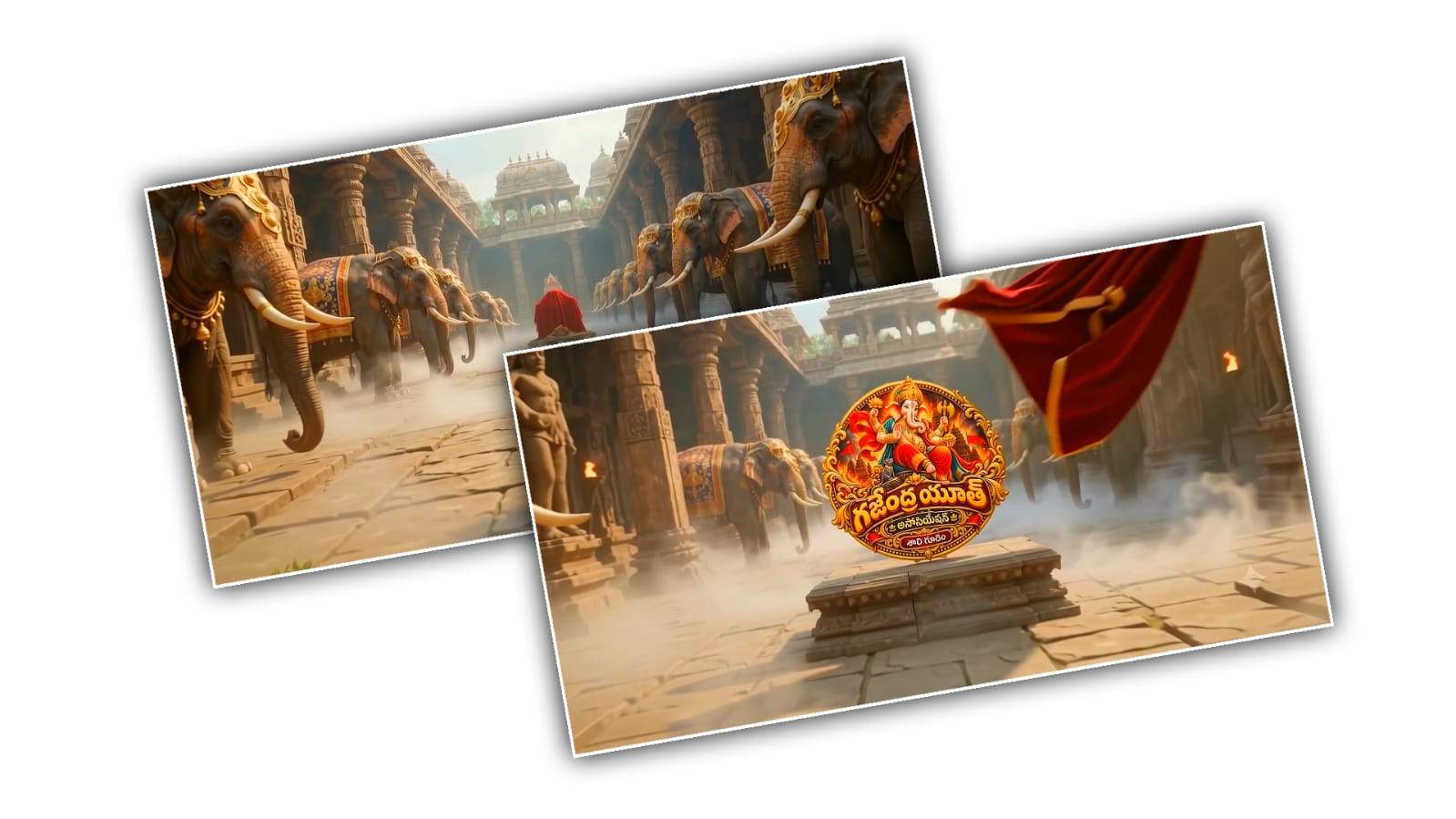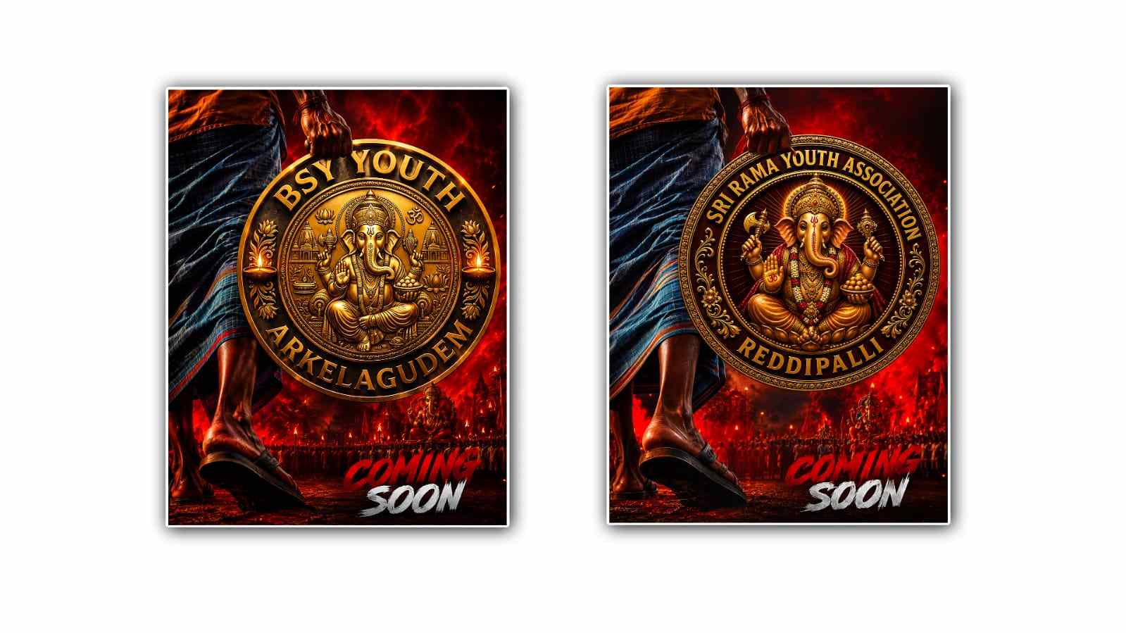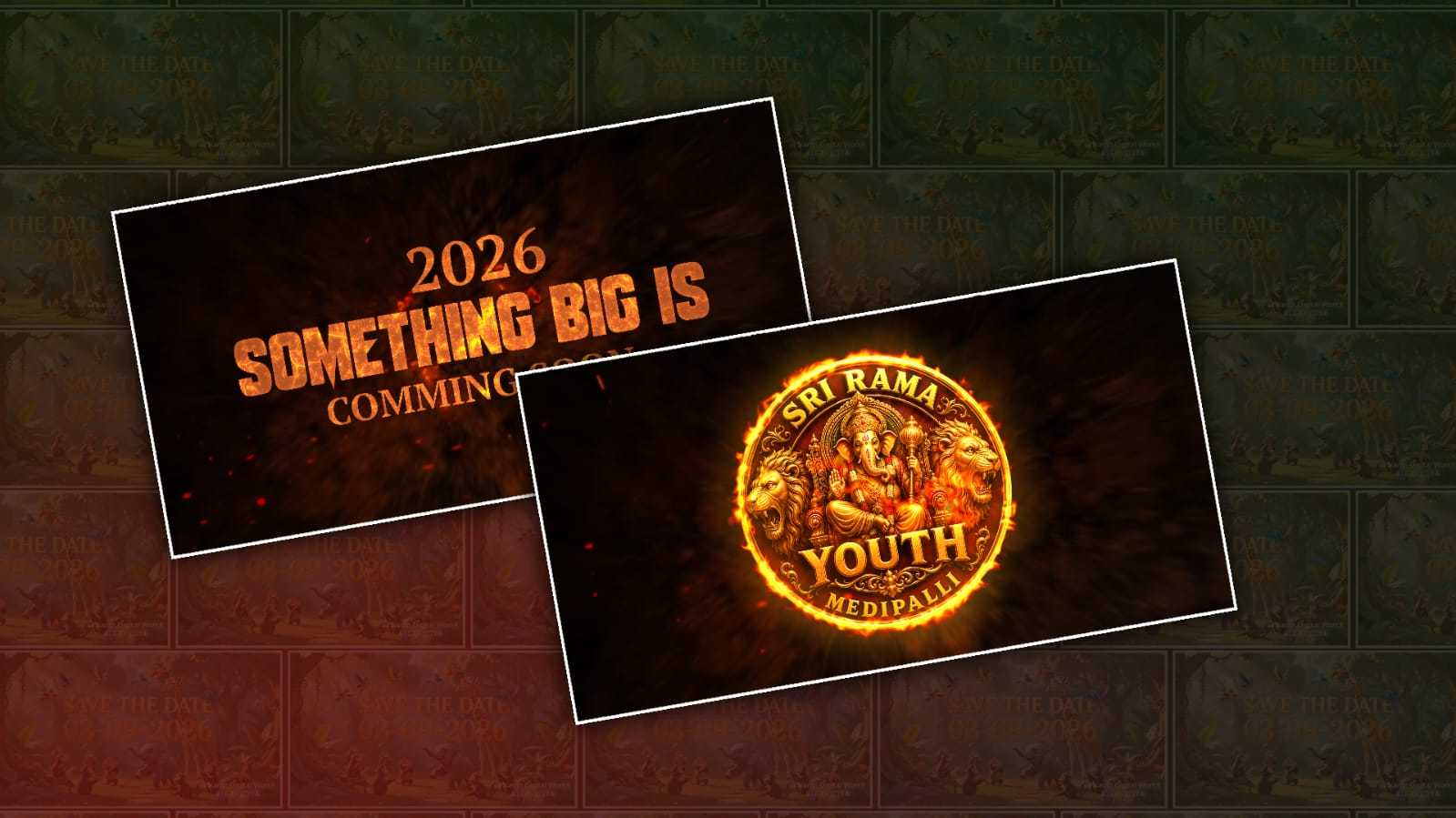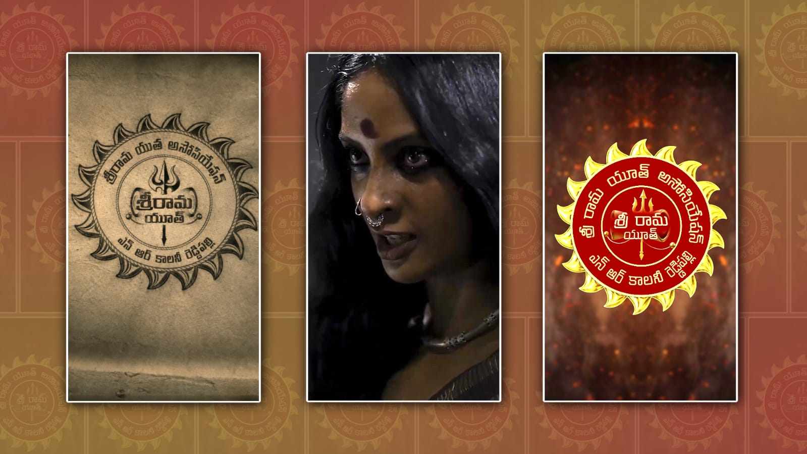
Creating a stylish and trending youth logo animation video has become much easier than it used to be. A few years ago, making a professional logo animation required expensive software, advanced editing skills, and a lot of time. Today, AI tools such as Google Gemini can help beginners turn a simple idea into a creative visual concept without needing to be a professional designer. If you have a brand, YouTube channel, Instagram page, gaming profile, college group, clothing brand, music project, or personal identity, a modern logo animation can make your content look much more attractive.
The first thing you need is a good logo. Your logo does not have to be complicated. In fact, simple logos often work better for animation because their shapes and letters are easier to recognise. You can use an existing logo or create a new logo concept with the help of AI. Think about the personality you want your logo to have. A youth-focused design can be energetic, bold, colourful, futuristic, minimal, street-style, or connected to current social media trends. The most important thing is that the animation matches the identity of the logo.
Once you have your basic logo idea, you can use Google Gemini to help develop the creative direction. Instead of simply asking for “a logo animation,” give Gemini a detailed description of what you want. Explain the colours, mood, background, movement, lighting, camera style, and overall feeling. For example, you could describe a logo appearing from glowing particles, followed by a fast camera movement, colourful light streaks, and a clean final reveal. The more clearly you describe your idea, the easier it becomes to get a result that feels intentional rather than random.
One popular style among younger audiences is a futuristic neon animation. Imagine a dark background with purple, blue, pink, or green lights moving across the screen. Small particles begin to appear, gradually forming the outline of your logo. The logo then becomes brighter, with a short burst of light before settling into its final position. This type of animation can work especially well for gaming channels, technology pages, music brands, fashion accounts, and social media creators.
Another interesting approach is a fast-paced street-style animation. In this style, the logo can appear through graffiti-inspired effects, quick zooms, energetic transitions, colourful textures, and urban backgrounds. The animation should not feel too slow because younger viewers are generally used to quick visual content on platforms such as Instagram Reels, YouTube Shorts, and TikTok. A short, energetic logo reveal can grab attention within the first few seconds.
When working with Gemini, your prompt is extremely important. Instead of writing a short request, describe the animation almost like you are explaining a scene to a professional motion designer. Mention that you want a modern youth-oriented visual, smooth motion, strong contrast, cinematic lighting, clean logo visibility, and a professional finish. You can also specify the format you want, such as a vertical composition for short-form social media or a horizontal composition for YouTube.
It is also useful to experiment with different concepts rather than accepting the first idea. Ask Gemini for several creative directions. One version could be futuristic, another could be minimal, another could have a colourful street aesthetic, and another could have a premium cinematic appearance. Comparing different ideas helps you discover which style fits your brand best. Sometimes the most interesting result comes from combining two different concepts.
Color selection can make a huge difference in the final appearance. Bright neon colours can create an energetic,c youth-focused feeling, while black and white with a small amount of colour can look more premium and modern. Blue and purple often create a futuristic appearance, while red and orange can feel powerful and energetic. If your existing logo already has specific colours, try to keep the animation consistent with them. This makes the final video feel like part of the same brand rather than a separate visual.
Motion is another important element. A logo animation should have a clear beginning, middle, and ending. You might start with an empty background, introduce small particles or light, build anticipation, reveal the logo, and finish with a subtle glow or movement. Avoid adding too many effects just because they look impressive individually. Too many flashes, transitions, and particles can make the logo difficult to see. Good animation is not necessarily the animation with the most effects. It is the one where every effect supports the main visual.
Sound can also make a simple animation feel much more professional. A short whoosh, impact, digital sound, or bass hit timed with the logo reveal can add energy. If you are creating content for social media, make sure you have the appropriate rights to any music or sound effects you use. Even a very simple logo reveal can become much more memorable when the visual movement and sound happen at exactly the right moment.
For social media, keeping the animation short is usually a smart choice. A five-to-eight-second logo reveal can be enough to create a strong impression. The viewer should understand the logo almost immediately. If the animation takes too long before showing the actual brand, people may lose interest. You can also create different versions of the same animation for different platforms. A vertical version can be used for Shorts and Reels, while a horizontal version can be used for YouTube videos or presentations.
Another advantage of using AI during the creative process is that you can keep experimenting without starting completely from scratch every time. If you like the colours but dislike the movement, ask for a different motion style. If the animation feels too serious, request something more energetic and youthful. If the background is distracting, ask for a cleaner background. This back-and-forth process can help you refine the idea until it feels closer to what you imagined.
However, it is important to remember that AI is a creative assistant, not a replacement for your own taste. The trendiest animation is not necessarily the best animation for every brand. Trends change quickly, especially on social media. A visual that looks popular today may feel outdated later. Instead of copying every trend, take inspiration from current styles and add something unique to your own identity.
Once the visual concept is ready, you can use a suitable video or editing workflow to turn the concept into a finished animation. You may need to adjust timing, add sound effects, improve transitions, resize the video, or make small colour corrections. These final touches can make a noticeable difference. Even if AI creates most of the creative direction, human editing can give the final video a more polished and personal feel.
The best part is that you do not need to be an expert before starting. Begin with a simple idea, explain it clearly to Gemini, experiment with different styles, and improve the concept step by step. Your first result may not be perfect, and that is completely normal. The more you experiment with prompt colours, movement, and visual styles, the better you will become at communicating your ideas to AI.
A modern youth logo animation is ultimately about creating an instant connection between your brand and your audience. Whether you want something futuristic, colourful, energetic, minimal, cinematic, or street-inspired, Google Gemini can help you explore the creative possibilities much faster. With a strong logo, a clear concept, thoughtful prompting, and a little editing, you can create an eye-catching animation that feels fresh and suitable for today’s social media audience. The key is to keep it recognisable, keep it engaging, and most importantly, make sure the final style feels like your brand rather than simply another copied trend.
Image Prompt
Use the uploaded image as the EXACT visual and composition reference. Create a 9:16 vertical photorealistic image showing a handmade youth association emblem painted/engraved directly on an old rough cement wall.

RECREATE THE SAME LOGO STYLE, SAME CIRCULAR COMPOSITION, SAME SUN-RAY OUTER BORDER, SAME DOUBLE CIRCULAR RINGS, SAME TRIDENT SYMBOL IN THE CENTER, SAME HAND-DRAWN BLACK INK/CHARCOAL LINE ART, SAME TYPOGRAPHY STYLE, SAME TEXT PLACEMENT, SAME AGED WALL TEXTURE, SAME SHADOWS, SAME VINTAGE DARK CINEMATIC LIGHTING and SAME overall appearance as the reference image. The logo must look physically painted/etched onto the wall — NOT a clean digital logo, NOT a modern vector logo, NOT 3D.

CENTER:
Replace the existing center youth name with:
"[YOUTH NAME]"

OUTER CIRCLE:
Use Telugu text containing the youth association name and village name:
"[YOUTH NAME] యూత్ అసోసియేషన్"
"[VILLAGE NAME]"

Keep the Telugu text arranged naturally around the circular ring exactly like the reference.

IMPORTANT:
Do not copy the existing names from the reference.
Only replace them with the provided YOUTH NAME and VILLAGE NAME.
Keep the same logo structure and visual design. The emblem should be centered vertically with realistic wall perspective.
Keep generous empty wall space around the emblem.
Warm brown/sepia monochrome tones, dark black markings, subtle grime, realistic imperfections, soft vignette, cinematic low light, authentic rural wall-painted aesthetic. No people, no extra objects, no modern graphics, no colorful elements, no additional text, no watermark. Aspect ratio: 9:16 Ultra realistic, highly detailed, cinematic photography.